Basic Hero
Some Title
This page is going to show how a tableau dashboard with adaptive layouts configured render based on the size of the section and block it is contained within.
The dashboard on Tableau has been set to "Automatic" size for the Default and the Phone size has been set to "Fit Width", with height set to 1150 px.
Desired Behavior: The dashboard should fill out the space available to it, adapting to mobile view only if the website itself is also adapting to mobile layout. So, depending on the width of the section that the content block is within, if there is no display ratio set by the content embed block, the user would expect to get the dashboard that best fits that area.
Actual Behavior / Problems:
- The layout of the dashboard is inconsistently or unpredictably selecting to the mobile layout of the dashboard
- The dashboard is frequently getting cut off unpredictably, even no display ratio is set
- White space is rendered underneath dashboards
- the display ratio is not working as intended
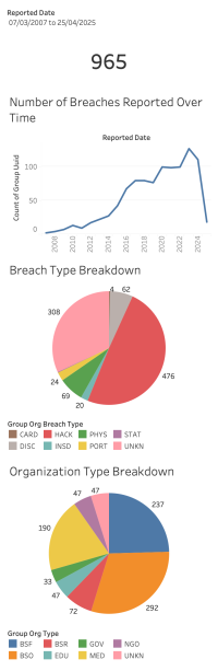
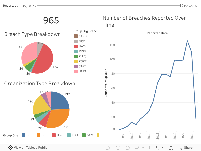
Examples of correct rendering styles:
See below for two images which demonstrate the expected visual layout of the default/mobile dashboards.
Normal Width Section
Wide Width Section
Narrow Width Content
Full / Normal Section
Full / Wide Section
Full / Full Section
2 columns, normal width, left sidebar
2 columns, normal width, left sidebar